Play
Part 1 - Step by Step
- InstructInstruct students that they are going to use their robot to collect data about the bottom of the bridge. They will run a project that will print data to the Print Console in VEXcode GO. Printing data in this way will let students view and record the data after the project is finished running. Watch the video below to see an example of this project in action, with the robot driving below and sensing the bottom of the bridge. The 'Eye hue in degrees' sensor data is shown updating live.
Note: Students should focus on the data printed to the Print Console when the project is run. The goal of the Lab is on data, not coding the robot. As such, students do not need to understand the coding concepts in the Printing Data project in order to complete the Lab activities.
Video file - ModelModel how students will open and run the project in VEXcode GO. Use one group's setup, and be sure that students can see the Print Console in VEXcode GO clearly. You can have students gather around the setup, or project VEXcode GO for the whole class to see.
Note: If you cannot load the Printing Data project to students' devices, implement Play Part 1 as a demonstration. Download the project to one device, and have the whole class use that data set to complete the Lab activities.
- Model for students how to open the Printing Data project in VEXcode GO. (Be sure students have the project downloaded to their devices prior to starting the lesson. Access the project in the Materials List on the Summary page.)
-
Open the File menu, then select Open. Use your device's interface to select the Lab 2 Printing Data.goblocks project.
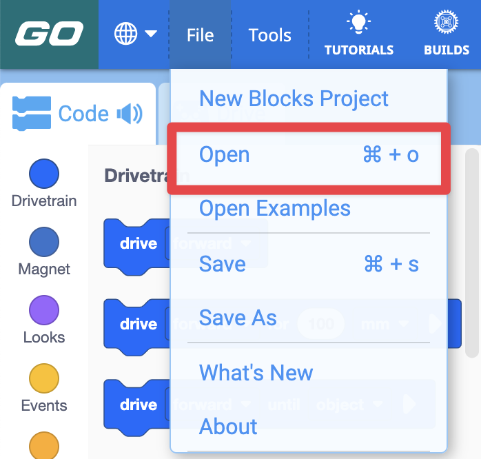
- View these device specific articles to learn more about opening an existing project in VEXcode GO: Chrome Browser; iPad; Android; Chromebook.
-
Once open, the project should look like this image. Remember, the focus of the Lab is on data, not coding. Students do not need to build or edit this project in any way, they should simply run it as a tool to print the data they will use in their Bridge Inspection Reports.
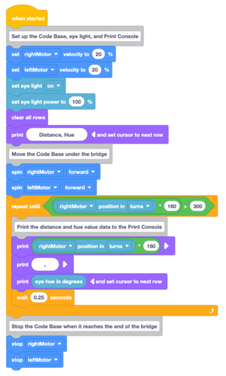
Lab 2 Printing Data project
-
- Model how to open the Monitor in VEXcode GO to view the Print Console.
-
Select the Monitor icon in the Toolbar.
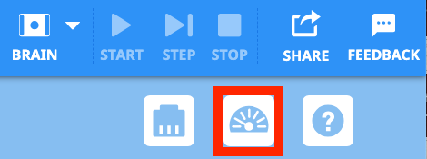
Select the Monitor icon in the Toolbar -
Call students' attention to the Print Console in the bottom portion of the Monitor, as shown here. This is where the data that is printed when the project is run is going to appear.edu
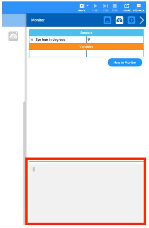
Print Console in the Monitor
-
-
Model how to setup and run the project. Set the Code Base at the start of the bridge, with the Eye Sensor pointing upwards beneath the bridge. Be sure the Eye Sensor is aligned with the Yellow Beam of the bridge, and that the Code Base is pointing straight ahead.
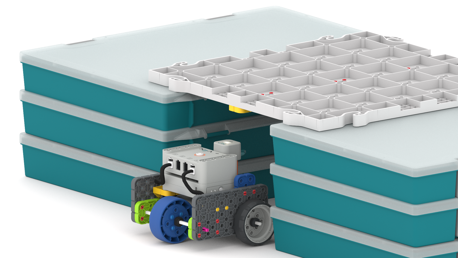
Align the Eye Sensor below the Yellow Beam of the bridge -
Select Start to start the project.
Select 'Start' - As the project is running, call students' attention to the values that are being printed in the Print Console.
- The robot should drive slowly under the bridge (at 20% velocity), and will print the distance and hue value data at regular intervals approximately every 0.25 seconds.
- For each entry, the 'Distance' value is how many millimeters (mm) the robot has traveled, and the 'Hue' is the reported hue value from the Eye Sensor at that point in time.
-
Here is an example of what the Print Console data could look like when the project is running:

Sample data in the Print Console
- As the project is running, call students' attention to the values that are being printed in the Print Console.
-
Select Stop to stop the project, when it is completed.
Select 'Stop' to stop the project - You may want to run the project multiple times so that students can pay attention to how the robot is moving as well as the data being printed in the Monitor, so they are prepared when they run the project for themselves.
-
Be sure to select Clear to clear the Print Console before running the project again, so that only one data set appears at a time.
Select 'Clear' to clear the Print Console
-
-
-
Show students how to scroll through the Print Console to be able to view all of the data that was printed, as shown in the video below. A mouse cursor drags the scrollbar in the Print Console up and down to view all of the printed data.
Video file
- Model for students how to open the Printing Data project in VEXcode GO. (Be sure students have the project downloaded to their devices prior to starting the lesson. Access the project in the Materials List on the Summary page.)
- FacilitateFacilitate conversations with students as they are running the project and viewing the data in VEXcode GO.
Be sure the Code Base is driving straight through beneath the bridge, with the Eye Sensor aligned with the colored beams.
- To ensure that students' data is reporting as intended, look for a pattern in the data. You should see data that has a pattern of:
- a section of hue values in the 30-80 range (for the Yellow and Green Beams)
- a section in the 200-300 range (for the Blue Beams)
- a second section of hue values in the 30-80 range (for the next Green and Yellow Beams)
- If students' data does NOT include hue values in the 200's range, the robot may not be positioned correctly under the bridge. Have them run the project again, and check that the robot is aligned correctly.
To help students focus on the data that is being printed, ask questions like:
- What data is being printed in this project? What are the two values? What do those values together, tell you?
- Why is it important to know the distance the robot has travelled each time the hue value is printed?
- Why is it helpful to print the data in this project, rather than just watching the Monitor like we did in Lab 1?
- We are collecting a lot of data points in this project. Why do you think that is helpful?
Help students continue to think about the connection between light and Eye Sensor data in this project, by asking questions like:
- Why do you think it is important to have the eye light on in this situation?
- How might the data be different if the eye light were off? Do you think the data would be as accurate? Why or why not?
- To ensure that students' data is reporting as intended, look for a pattern in the data. You should see data that has a pattern of:
- RemindRemind students that they can run the project multiple times to make sure the data they are getting follows a similar pattern each time. The values may not be exactly the same each time, but the pattern should remain the same. Encourage them to think about why it might be helpful for bridge inspectors to gather data, then confirm it.
- If students run the project multiple times, remind students to clear the Print Console between each run.
- Be sure that each group has a data set showing in the Print Console at the end of Play Part 1, so that they can graph the data in the Play Part 2.
- AskAsk students to think about how the quantity of data points collected affects the way we can use data. Do they think more or less data is useful in real life scenarios? For instance, if they were surveying students in school to learn about their favorite ice cream flavor, would they want to survey just a few students or many? Why? How could having more or less data affect their results?
Mid-Play Break & Group Discussion
As soon as every group has printed the data to the Print Console in VEXcode GO, come together for a brief conversation.
Discuss with students the data they see now that they have run the project. Now that we have data about the bridge in the Print Console, let's talk about what data we see.
-
Each line of of the print console is a 'data point'. There are two numbers in each data point.
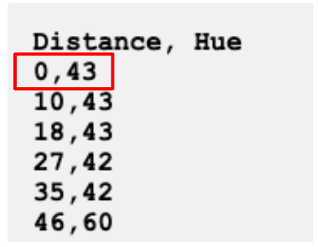
A data point in the Print Console - What do those two numbers represent?
- The first number reported is 'Distance'. This is the distance the robot has travelled beneath the bridge.
- Why might distance data be important when we're thinking about a bridge?
- The second number reported is the 'Hue'. This is the hue value reported at that location.
- We looked at hue value data in Lab 1. Who remembers what hue value is?
- The first number reported is 'Distance'. This is the distance the robot has travelled beneath the bridge.
- Our Bridge Safety Criteria has Hue Value Information in it. What can we learn about the surface of the bridge from the hue value data we have?
- Do you have any data points with hue values greater than 200? What does that mean?

- Our next step is to graph the data from the Print Console in VEXcode in our Bridge Inspection Reports. This will help us to see if there is a pattern to our data. How do you think the 'Distance' and 'Hue' data in the Print Console connects to the graph?
- Talk with students about how they think they can represent the data points on the graph. They will learn how to plot each point in Play Part 2.
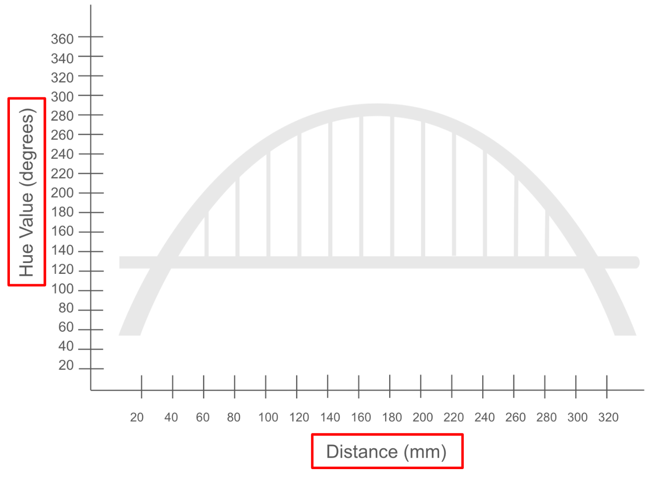
Part 2 - Step by Step
- InstructInstruct students that they are now going to graph the data from the Print Console. There are many ways to visualize data, and graphing the data can help students to identify patterns in the data more easily.
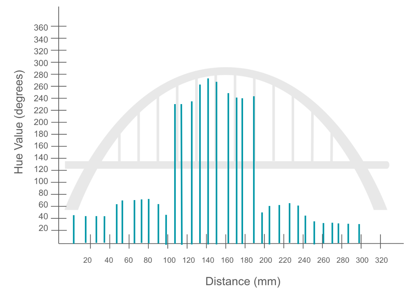
Sample Graph of the Data - ModelModel for students how to graph the first data points from the Print Console onto the graph in the Bridge Inspection Report. You can demonstrate this for the class, or have students follow along with you in a guided demonstration.
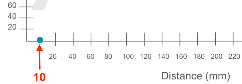
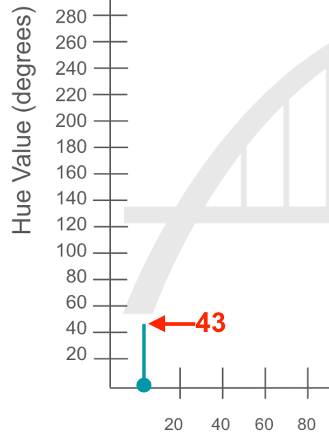
Each data point will be represented by a line on the graph. The example here will show how to graph the point 10, 43.
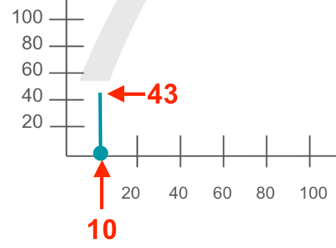
Graph of the point 10, 43 - First, model how to plot the distance value of a data point on the x-axis of the graph – labeled Distance (mm).
-
Mark the point that corresponds to the distance value along the x-axis, as shown here. (The arrow shows the point at approximately 10 on the x-axis.)
Mark the distance value -
Next, draw a line upwards from the point on the x-axis to the hue value along the y-axis – labeled Hue Value (degrees) on the graph. The line here shows the hue value of approximately 43.
Draw a line to show the hue value
-
-
The graph should show each data point as a separate line, with a pattern where the 'crack' data points look like a 'spike' in the graph. This example shows a partial Data Log plotted on to the graph.
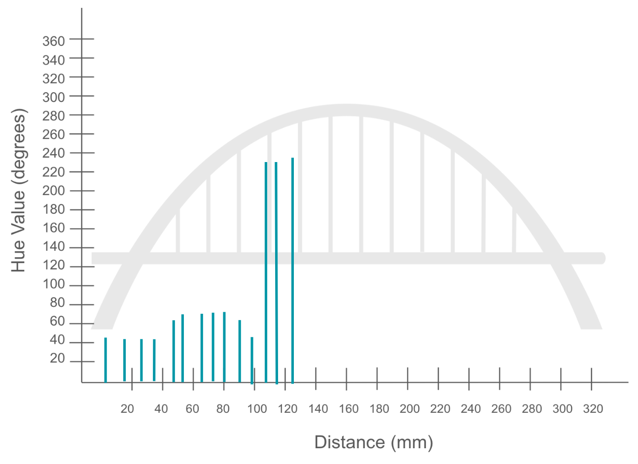
Example of data plotted on the graph - Remind students that they will be approximating the values on the graph using the scales provided, and that each data point does not need to be exact, but should be close.
- Students can mark halfway between each of the intervals on the x and y-axes, to see the intervals by 10's rather than 20's.
- Once students have completed their graph, they should check in with you. Students will then record the data points that correspond to a crack in the data table in the Bridge Inspection Report.
-
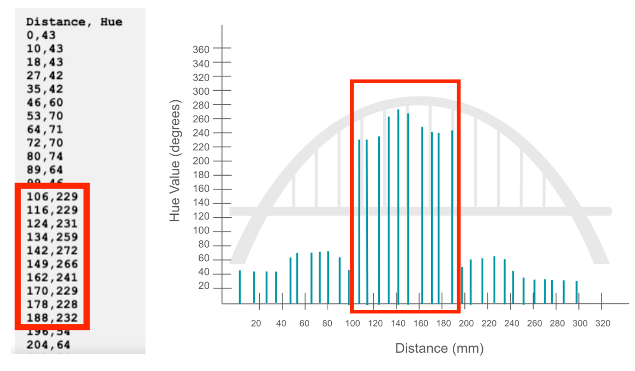
Model for students how to identify which data points correspond to a crack. A hue value greater than 200 indicates a crack. Students can look at both the graph and the Print Console to identify the data points with a hue value over 200.
'Crack' data in the Print Console and on the graph - Model how to record a data point of the crack from the Print Console into the Data Table in the Bridge Inspection Report.
-
The Distance is recorded in the Distance column, and the Hue is recorded in the Hue Value column, as shown here.
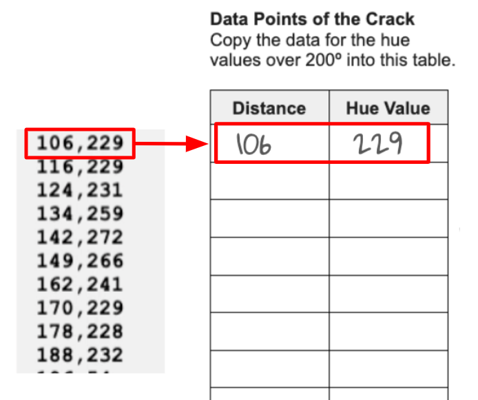
Record the data points in the table -
Students should record the data points in order (as they are in the Print Console), from the smallest distance to the largest distance value.
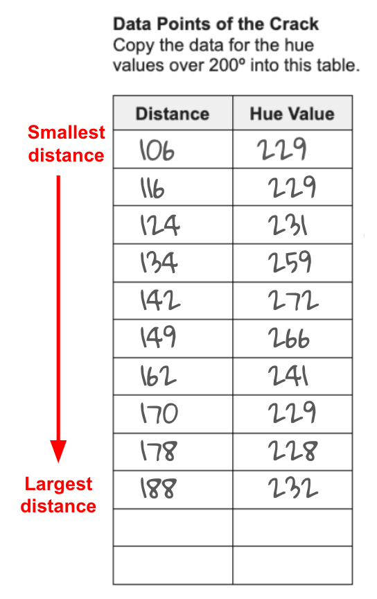
Record data points in order
-
-
- First, model how to plot the distance value of a data point on the x-axis of the graph – labeled Distance (mm).
- FacilitateFacilitate conversations with students about graphing and recording the data as they work in their groups.
Encourage students to start to think about any patterns they can see in the data, by asking questions like:
- What do you notice about the data? Do you see any patterns in the distance values?
- Do you notice any patterns in the hue values? What do you think that means? Why?
- Does the bridge have a crack? How do you know?
To help students think about how they are visualizing their collected data, ask questions like:
- Do the Print Console and graph show the same data? Can you explain to me how the data points on the graph connect to the Print Console?
- Which is more helpful for you to identify the cracks in the bridge? Why?
To help students practice their graph reading skills, ask them to identify one or two data points on the graph. This can also help you ensure that they understand how the data is represented in the graph.
- If students are struggling to connect the data points to the graphed lines, try isolating the data so they can focus on one aspect at a time.
- Have them point to where the distance values 50, 100, or 150 are along the x-axis.
- Have them point to where the hue values 80, 150, or 220 are along the y-axis.
- Then have them draw with their finger where the lines for 50, 80; 100, 150, or 150, 220 would go.
When students complete their graph, have them check in with you. Be sure that each group's graph has the same pattern of data. You should see a marked 'spike' in the graph lines in the center of the graph, to represent the crack.
- Once they have completed the graph, be sure that students record the data points of the crack in the Data Table in the Bridge Inspection Report.
- If students complete graphing and recording their data early, ask them to think about how they would identify the location of the crack based on their graph. Do they think it is it in a Safe, At Risk, or Dangerous Zone? Why?
Note: Students will be continuing to work with the data points of the crack from this Lab and their Bridge Inspection Report in Lab 3. Be sure that the reports are collected for use in the next Lab.
- RemindRemind students to take turns graphing the data with their partner. One partner should read the data point, while the other graphs it. They can switch roles every 5 data points to ensure that both partners get a chance to work with the data and the graph.
Remind students that the 'reader' should check the line drawn by the 'grapher' to be sure that it matches the data point accurately.
- AskAsk how they think showing the same data in different ways can be helpful for people to learn from it. Think about situations like a restaurant menu where a picture and a written description of the food are given – this is the same data, shown in two ways. Why is having multiple ways to visualize data useful?